
Buddy Travel
Brand identity · 2026 · Human-led, AI-assisted
From an original idea to a complete brand identity.
Buddy Travel is an outdoor travel brand built around local knowledge, shared experiences and a more personal way to explore Bulgaria. I led the brand identity process from creative concepts to client-approved artwork, using AI selectively for rapid prototyping, presentation and application visualisation.
Project snapshot
Client Buddy Travel, Bulgaria
Role Creative direction, brand identity, concept development, visual communication, design refinement and production preparation
Scope Three identity directions, interactive client presentation, colour strategy, logo system, print and digital applications, final brand package
Tools Procreate, Adobe Illustrator, Adobe Photoshop, ChatGPT and AI-assisted visualisation tools
The challenge
Buddy Travel wanted a recognisable identity that felt adventurous and approachable without falling back on predictable travel symbols. The brand needed to work on a vehicle, outdoor accessories, printed collateral and digital communication.
Our earliest conversation revealed another important consideration. The previous logo used blue and yellow because the client simply liked those colours. I questioned whether that combination served the brand, but treated the preference as a clue to explore rather than something to dismiss.
Three creative directions
Each proposal explored a different aspect of Buddy Travel. Crucially, each involved a different balance of independent design and AI assistance.
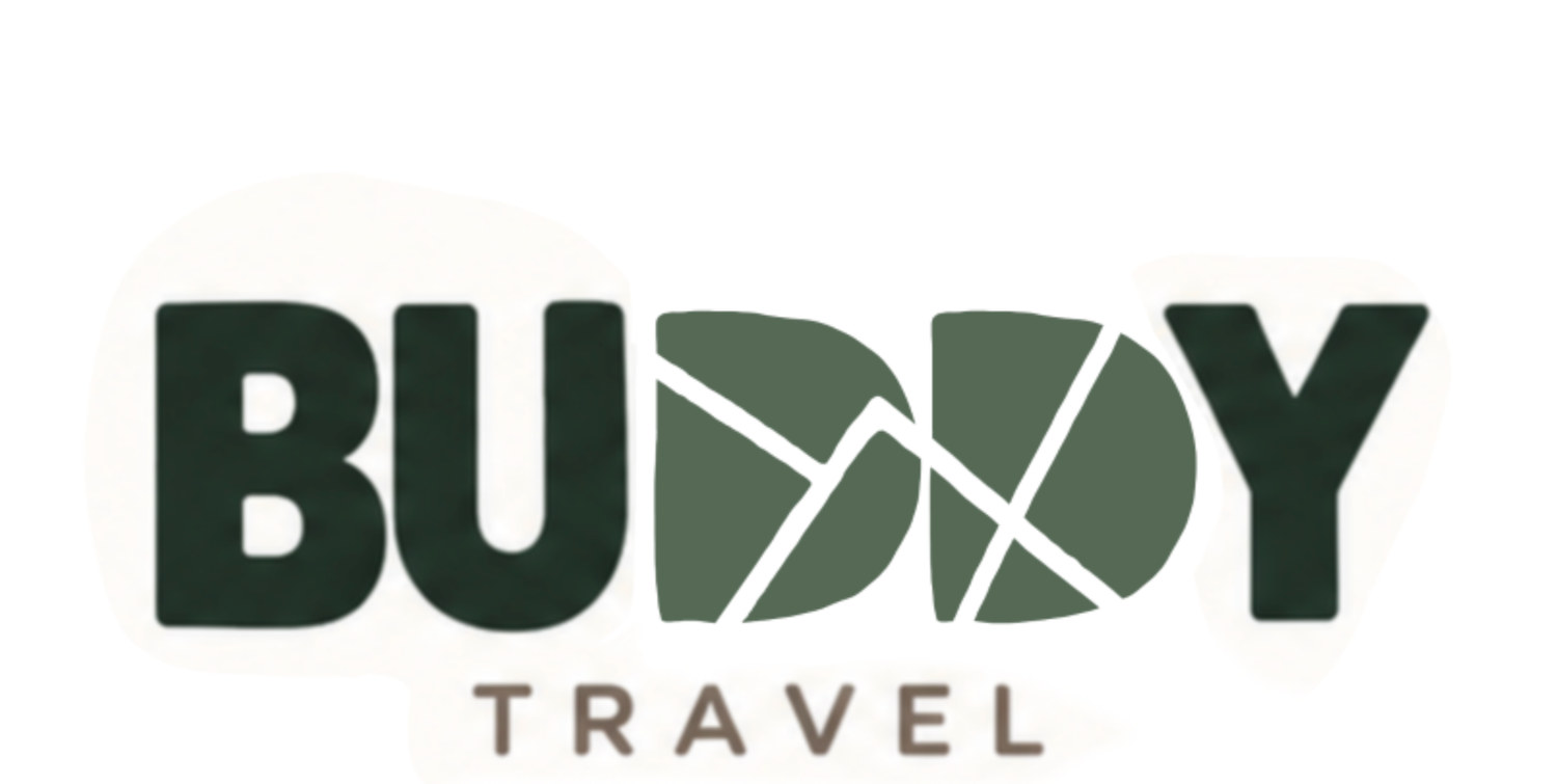
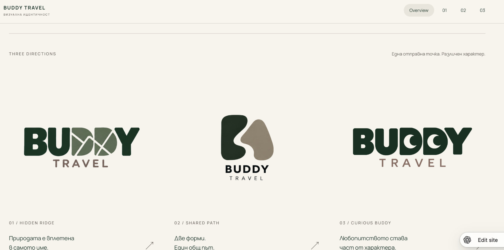
01 / Hidden Ridge
Original concept · no AI
I created this idea independently in Procreate, integrating a mountain landscape into the double D of BUDDY. This was the direction the client ultimately selected.
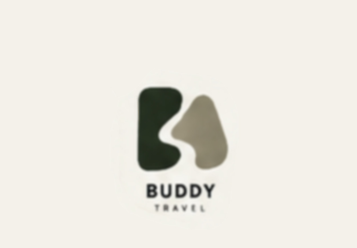
02 / Shared Path
AI prototyping · human selection and refinement
AI helped me explore abstract forms expressing two people moving along a shared path. I carefully evaluated the generated options, selected a promising mark and refined it for the proposed identity.
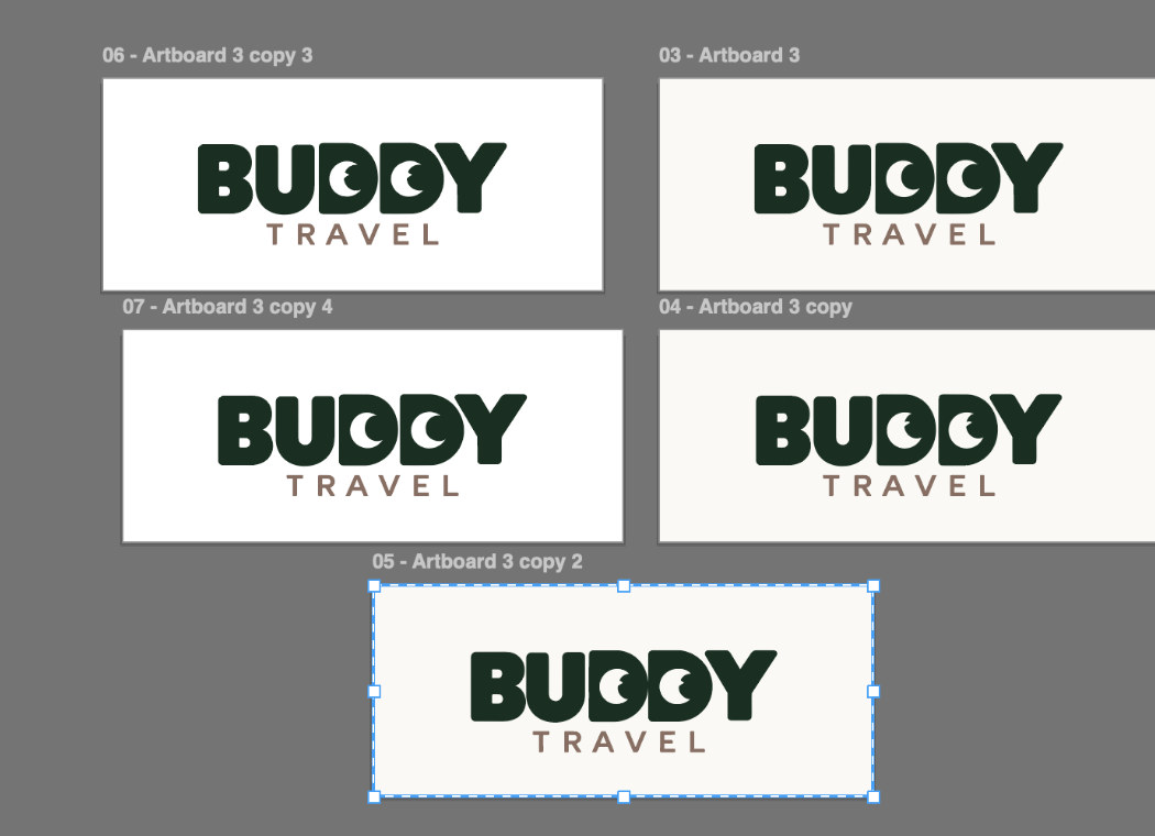
03 / Curious Buddy
Original idea · Illustrator artwork
The idea of turning the two D letters into a curious pair of eyes was mine. I developed the lettering and eye variations in Adobe Illustrator; AI supported rapid presentation exploration, not the invention of the concept.
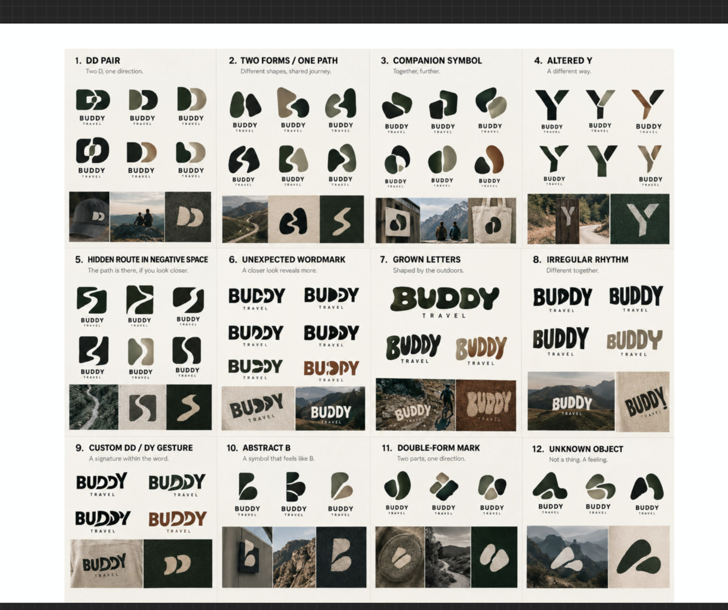
An interactive client presentation
Rather than presenting only static files, I worked collaboratively with AI on the structure and visual design of a small presentation website. It allowed the client to compare the three identity routes, understand their thinking and see early applications in context.
The selected concept: Hidden Ridge
The client chose my independently developed Hidden Ridge direction. The mountain motif is built into the wordmark rather than added as a separate tourism icon. From this original concept, I developed a more flexible visual system and explored how it could work across different touchpoints.
Colour strategy: listening before deciding
I remembered the client’s preference for blue and yellow from our first conversation. Instead of reproducing those colours literally, I developed two more considered proposals that expressed different personalities for the same selected logo.
Forest was grounded, natural and familiar, built around earthy greens and warm neutrals. Petrol Ridge was cooler, more open and contemporary, with blue-green mountain tones and a restrained golden accent.
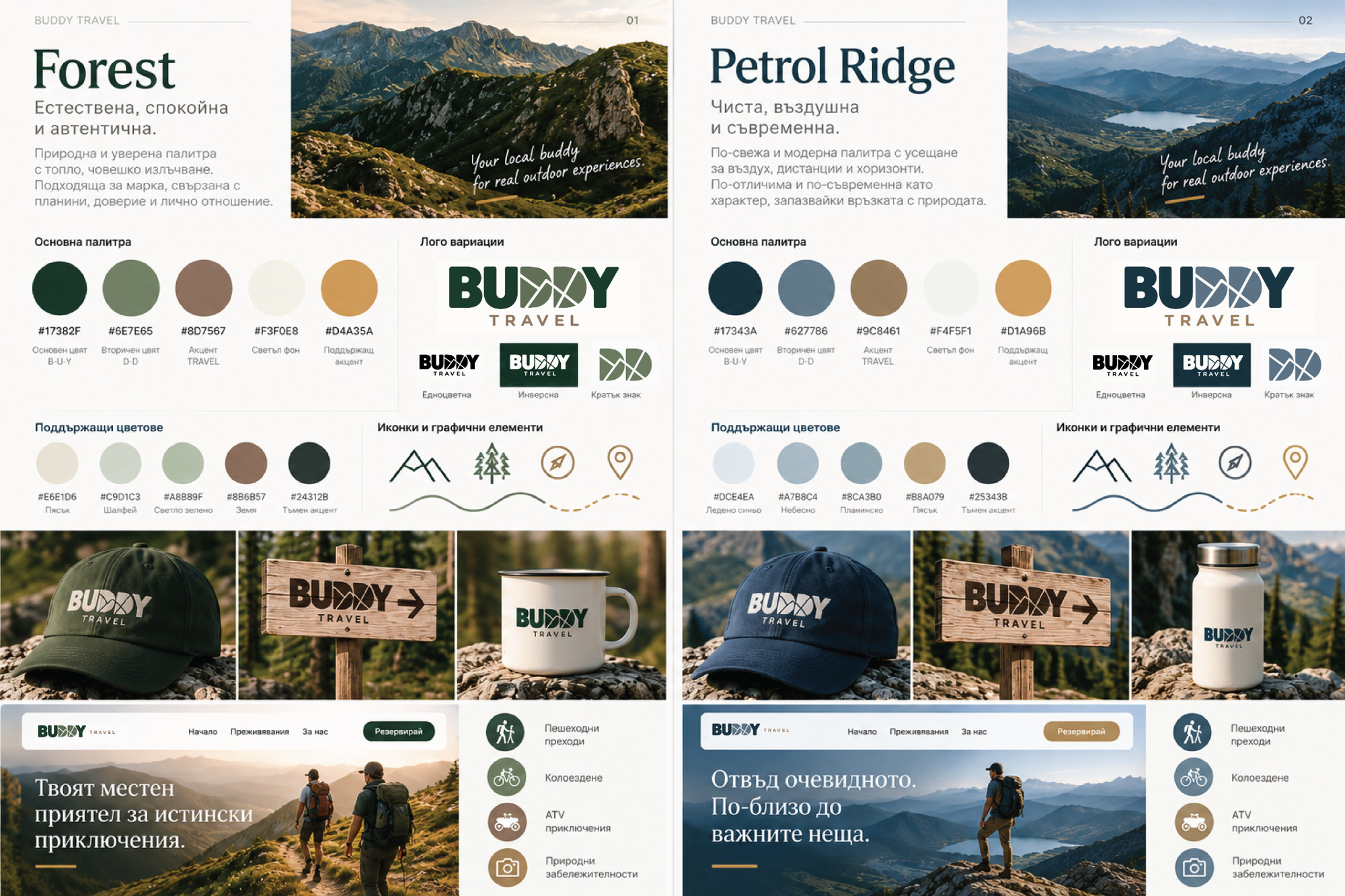
Direction 01 · Forest
Earthy, calm and familiar.
Direction 02 · Petrol Ridge · selected
Airy, distinctive and connected to the client’s earlier preferences.
I expected Petrol Ridge to resonate more with the client, and he selected it. The decision retained something personally meaningful from his previous identity while giving the brand a clearer visual rationale.
The final identity system
I extended the selected direction into primary and alternative logos, a standalone DD mark, colour specifications and applications prepared for different media. The logo files were organised for RGB and CMYK use, alongside supporting references and presentation assets.
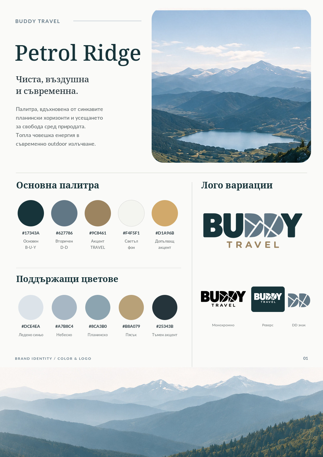
AI for speed. Design judgement for accuracy.
AI accelerated the visualisation of products and applications that could be manufactured or developed later. My responsibility was to assess the images as design proposals, identify what would not work and adjust the artwork accordingly.
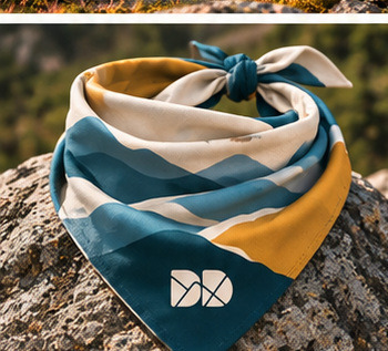
Bandana: design for real use
The generated design looked convincing, but I realised that placing the print exactly as shown would not make the DD mark appear correctly when the fabric was folded and worn. I manually reconsidered its orientation and placement.
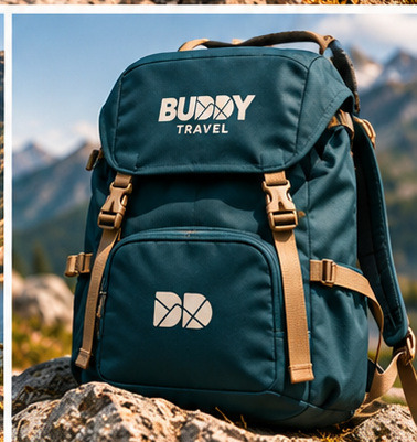
Backpack: testing an application
AI helped turn the approved identity into a rapid backpack prototype. I reviewed its visual balance and brand consistency, treating the image as an application concept rather than a manufactured product.
Human-led: original ideas, concept selection, typographic artwork, colour direction, design refinements, client communication and final production judgement. AI-assisted: rapid logo exploration in Shared Path, interactive presentation development and application visualisations.
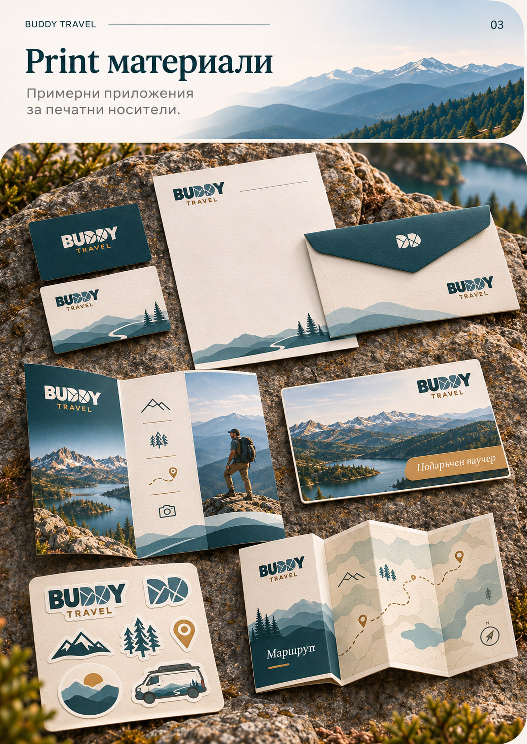
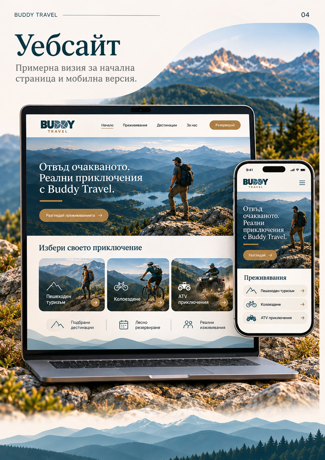
One identity, multiple applications
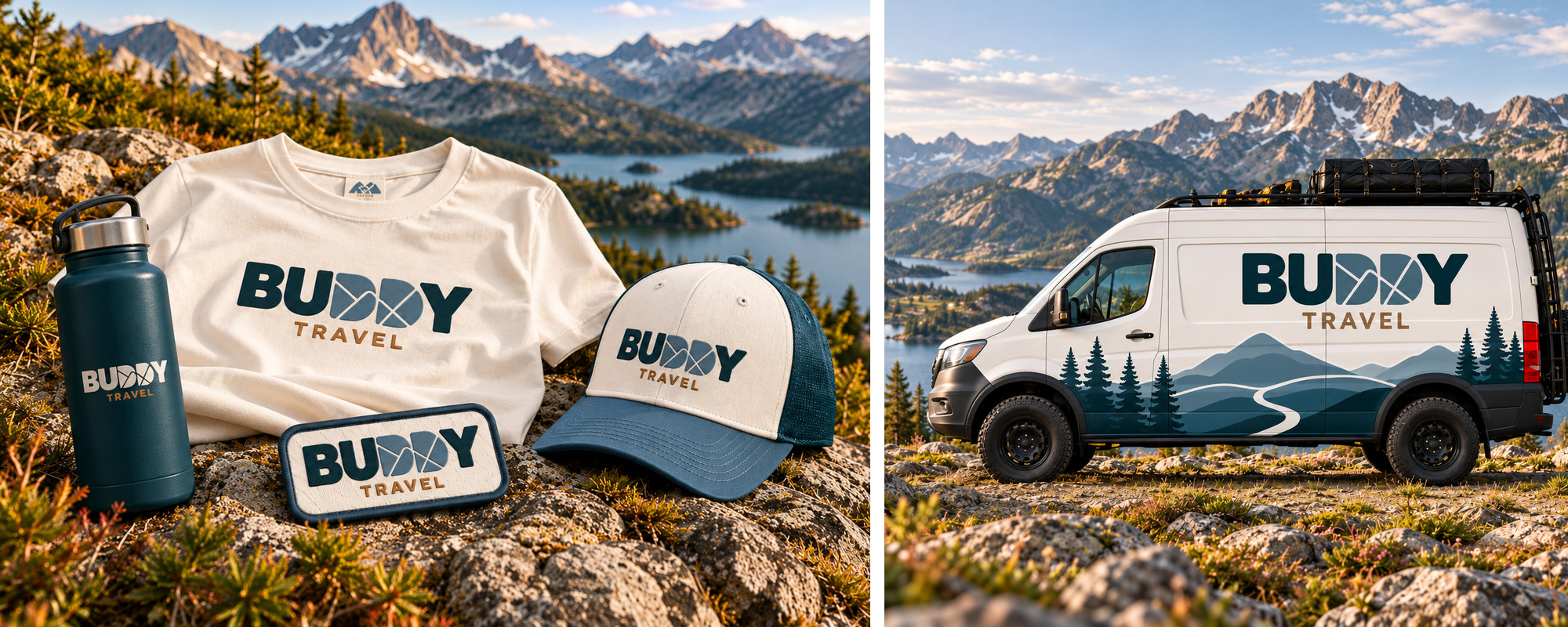
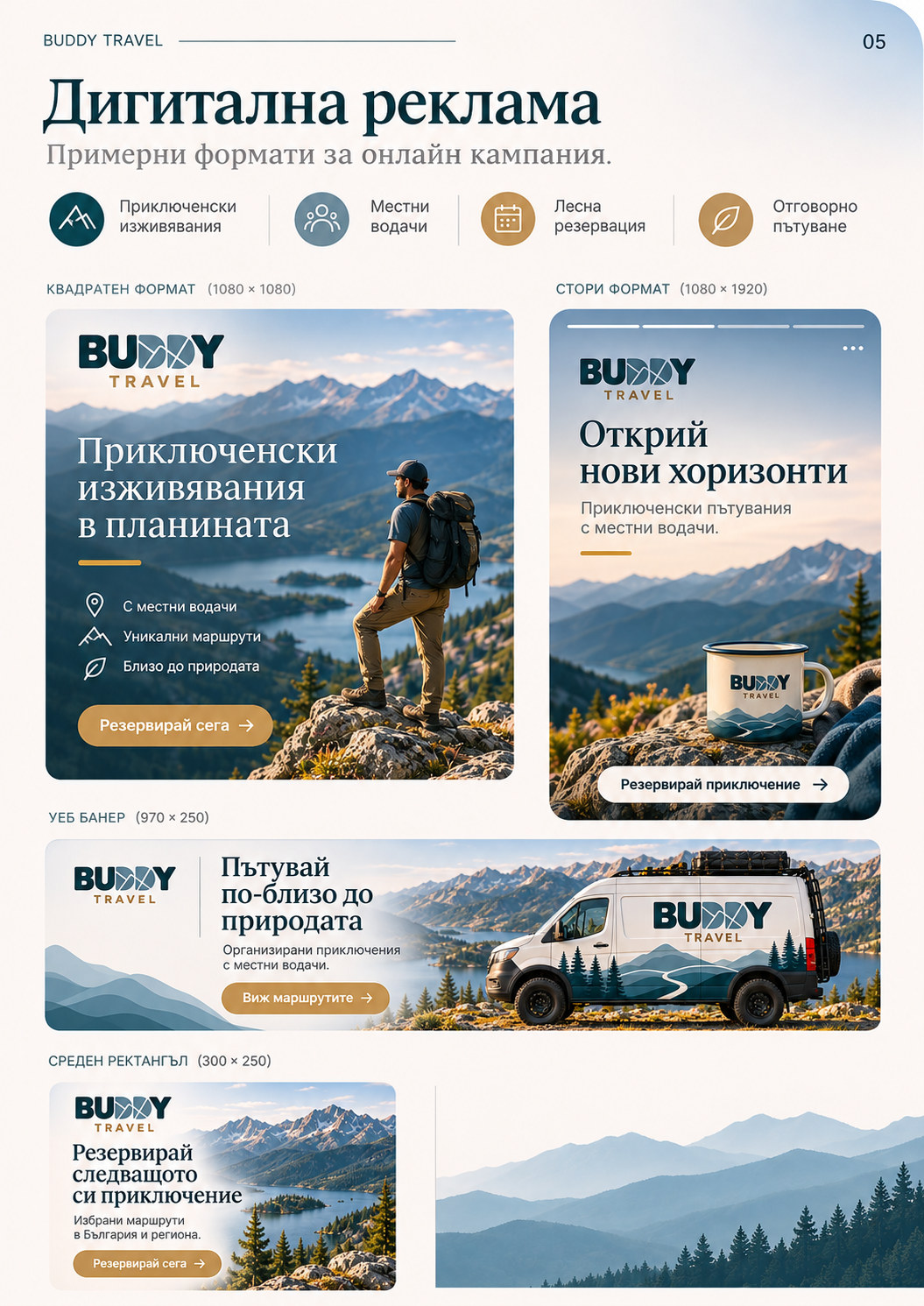
Beyond merchandise and vehicle concepts, the system was extended into print, web and digital communication examples. These demonstrate how the identity can remain recognisable across different formats.
Outcome & reflection
The final logo and identity system were approved and delivered to the client. Some of the brand assets are already in use, while other examples shown here are clearly conceptual applications and AI-assisted visualisations.
For me, the project’s central lesson was that AI is most valuable when used with a clear creative direction. It can generate options and visualise ideas quickly, but it cannot replace design authorship, listening to the client or taking responsibility for how a solution works in real use.
Design-led thinking. AI-assisted exploration. Human responsibility.